This year, I started thinking about the card around Halloween time and the finishing touches were done the week-end before Thanksgiving

1- Theme Spotting
Many ideas were thrown around. Some of them were really good and I encourage you to explore them for your own card or e-card if you are still on the drawing board.
Think about the “2011 Vintage” with a nice blend of all the wishes.
Think about comparing 2011 to 1911 to 1811 (or any other previous time). Compare shopping lists, new year resolutions, etc…
Nevertheless, none of those ideas made it to the final selection and our theme for this year was on a different tone.

2- Aha
I came up with this year’s theme by “borrowing” JFK’s famous quote and twisting it to my needs:
“Don’t ask how good 2011 will be to you, ask how good you will be to 2011”
Notice the “to 2011”, not “in 2011” giving the quote a nice “green” edge.
Everyone loved this theme so I was ready to work on layout composition and overall design.

3- Kids and Sketches
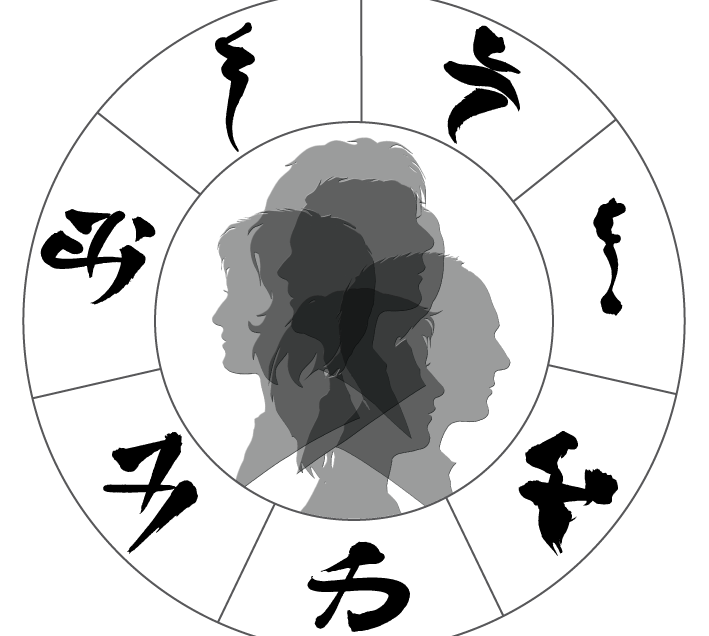
After browsing the photos of the year, quick selection of 9 photos (3 per child) and then sketching from the photos using Photoshop and Illustrator.
The process is fairly straight forward : desaturating the photo in Photoshop, adjusting the curves, applying a few filters (depending on the photo contrast, I may use photocopy , stamp, or other filters). Then readjusting levels, do some additional clean-up, move on to Illustrator where I live trace the photo using the one color logo settings, expand and do some final smoothing / clean-up.

4- Layout and Composition
Unlike last year, this year I was quickly settled on a 5×7 (in.) format. The challenge was to find the best composition. These are some of the trials. I ended up with a vertical layout (not shown in this photo)
One thing I wanted to explore is the quote itself with its repeating words : “Don’t” is the only word used once in the sentence. All the others appear twice. In addition the word combinations “ask how good” and “will be to” appear twice.

5- Let’s be square
Following the thought of the quote composition, I decided to go with a die-cut approach, allowing someone to read the full sentence by reading the first part when the card is folded (as soon as you get it out of the envelope) :
“Don’t ask how good 2011 will be to you”
And when you open the card, inside you read the second part :
“ask how good you will be to 2011”
All I needed is holes to be punched on the outside to reveal the inside “ask how good” and “will be to”.
And since we are at it, why don’t I continue with more holes revealing the kids sketches.
I love squares, so I opted to go with square holes using a manual die-cutter.

6- Text and Texture
Now that I am good on the composition, I started experimenting with different styles for the writing. I wanted something playful, joyful, not too formal. I settled for a free “loopy” form, using a cola pen with Noodler’s Black ink on Butcher paper. In addition to writing the quote, I used the same writing to fill in a page to use as a texture, Denise Lach style. This is where I added my famous best wishes in French that I include every year!

7- Colors and More
After exploring many different colors (most bright and flashy), the votes went to magenta and bright orange. You can see also that I incorporated the main writing in white, while fitting pieces of it in squares(when need be).
The text for texture is used twice at different scales with different levels of transparency.

8- Final Touches / The ribbons
On the inside, I married the 2 colors with a wavy line and used a ribbon like shape(slightly offset).
On the outside (backside), I extended the texture with one more copy of the text in a smaller scale, light gray (smoke) but arranged in a way to reveal a subtle 2011 vertically. The outer edge is also a ribbon, same color but with a simple “BEST WISHES” writing on it in French and English. (I tried that on the inside, but it was too much)

9- The Envelope
Simple, clean, white background. Following the ribbon and texture theme. The text and texture are graphite (black was too strong).
The Font I used for the name and address is “Huxtable”. I think it is a free font that you can download from the web. I found it to work well with the envelope and the theme, not formal with a hint of play.

10- Ready to go
Here it is the final outcome. Happy 2011 to all!!!
Some of you will receive it by mail. My first batch will be mailed out in a week or so.


Leave a reply